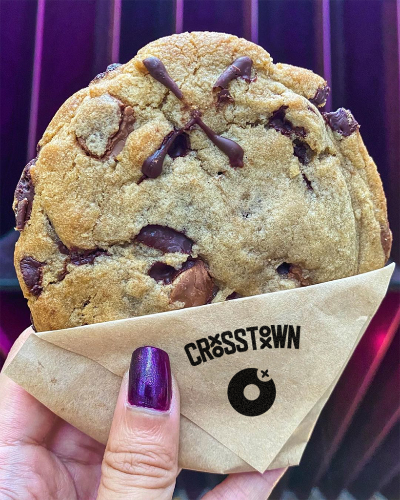
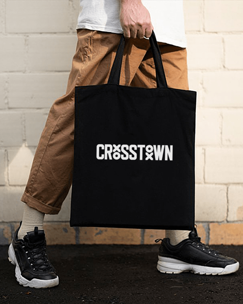
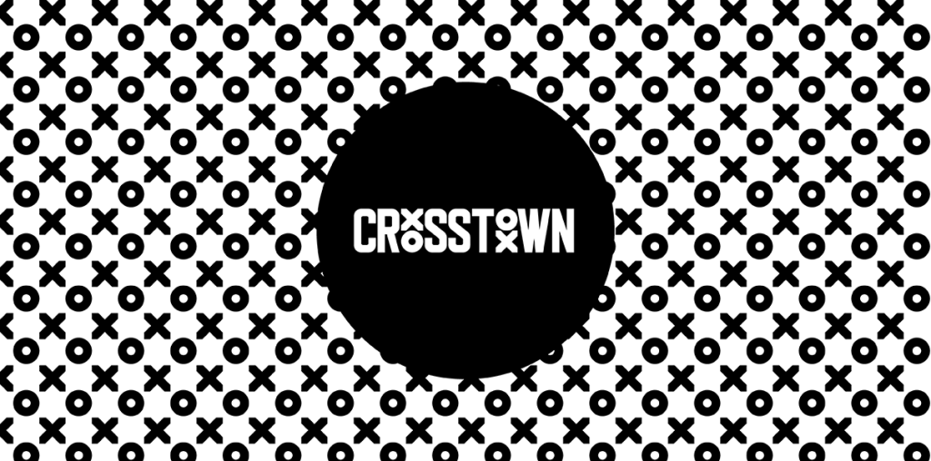
A self-initiated logo refresh for one of London’s favourite doughnut brands, because some things are worth doing just for the love of it.


Client
Self, Crosstown
Project Description
Crosstown’s original logo was hand-drafted by the founder when they set up their first street food stand in 2014. I’ve always loved their monochromatic branding but wanted to see what the logo could look like with the edges tidied up, the forms tightened, and the whole thing redrawn from scratch while keeping the character of the original completely intact. Unsolicited, unpaid, just a fun exercise in restraint.
